Tuesday 17 April 2012

Final final final final final tweeks..

Front Cover - I have added a few random words to make the page look more appealing and more like a magazine.

Hooray for Carbuncles spread - I have changed the style of the running head on all three articles to give it a more dynamic look. 

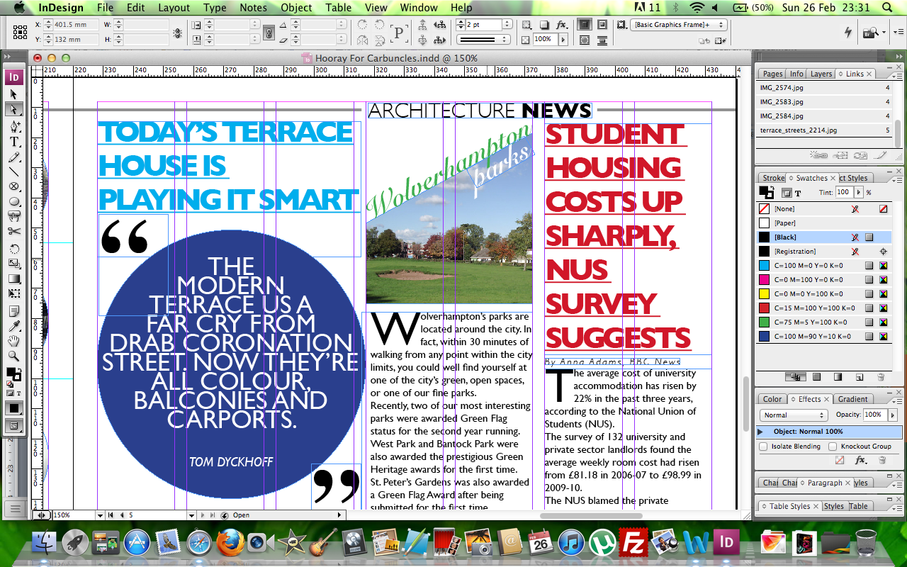
Articles spread - Here I have added some more images and changed some of the typefaces from Arvo to Avantgarde. I think it looks much more attractive and appealing to the target audience.

And these are the final items :).

Sunday 1 April 2012

Letterforms..

Just some of many :)

More.. Whatt??!! Yeeaah, there's more..

I just discovered the "Gradient Feather Tool" and it's one of the best tools (i think). Anyhow, heres a totally different front cover for the Arkitekt Zine. I have used a completely new image of the Art Gallery which I think works really well with the overall design. Also I have kept the header the same concept as on the DPS's.  
Comments I had received in the previous crit were to lessen the amount of concepts I was using. I have formatted all the text into 9/10pt with the highlighted text in the same colour, font across the double-page. I have also changed the font for the 'HOORAY' as now it is a slab-serif it appears as part of all 3 items as a set. 
Well this was a big improvement. I have totally changed the left hand page, I have added a 'large' image running down the page and slightly across the right hand page. The right hand page, I have kept the same groupings but experimented with space and position.

Oh yeah, the page size has now increased to 240mm x 340mm

Saturday 24 March 2012

Final Movements :)

This is a COMPLETE changeover compared to the previous design shown below. I have been more "experimental" with the ways in which I could have the text as readable and flows smoothly. Now it's just the wait for the comments on Monday :).

The issue with the previous was the bottom of the right-hand page. Is it any better? I think it is space wise and is more clear to read as it less squashed. I have also added captions to images and made some changes to the Wolverhampton's Parks article.

Monday 19 March 2012

I have improved both spreads by fixing a colour scheme as colours were everywhere previously. Note: these are not actual size. They have been printed on A4 and are 93% of the actual size so they aren't that far off. 


But which set do i choose? (ignore colours)

Thursday 1 March 2012

Further Development..

This is the second and improved design of the Architecture News DPS. 
Previous design.

Monday 27 February 2012

Onto the Mac...

I did not have much to show come this week until I thought maybe I could start to design the final DPS on InDesign.. and here it is...

In the end, I decided to use a 7 column grid each page. The first paragraph of text runs across 4 columns and is split into 2 columns (the gutter of these 2 columns matches up to the 3mm gutter of the grid. However, the second piece of text is also split into 2 columns but the gutter for these 2 columns runs halfway through the second column.  
This is the completed Double Page Spread.

As mentioned in today's crit, I found it difficult to insert a bigger semi-circle as planned in the layouts. After experimenting through a range of ideas, I finally got the above idea of having 6 circles of different images. 

Sticking with the circles, initially it was also a semi-circle planned here. But again, this did look a part of the above article, using circles like this allowed the two architecture articles to be linked and look as part of a set. Also, in order to make the circles fit, I text wrapped the 3rd circle with the text. Looks good :)

The left side page of the DPS is split into 3 articles, 1 runs across 3 columns and the other 2 run across 2 columns each. During today's crit, this was discussed and not being as successful as it can be. Also, the centre column "Wolverhampton Parks" does not look like a separate article like the other two. These problems are being addressed :).

Here is a close-up of the start of the 3 articles. The center column can be seen as a problem here. Also, whilst researching current magazines, I noticed how quotes were being designed. I used a similar approach, with this quote I experimented with kerning, leading and inner-character spacing. I did try to wrap this shape with the text in the centre article but just did not work. Also, the running head can be seen here too. 

This screen shot shows two more quotes from the final two articles. The first quote, I have manually condensed the font (vertically) and has been skewed. The second quote has been more vertically condensed and the inner-character spacing has been tightened.

Text has been wrapped around the 3rd circle.

Tom Dyckhoff's quote. 
Quotes of 2 news articles.

Final DPS.