 |
| In the end, I decided to use a 7 column grid each page. The first paragraph of text runs across 4 columns and is split into 2 columns (the gutter of these 2 columns matches up to the 3mm gutter of the grid. However, the second piece of text is also split into 2 columns but the gutter for these 2 columns runs halfway through the second column. |
 |
| This is the completed Double Page Spread. |
 |
| As mentioned in today's crit, I found it difficult to insert a bigger semi-circle as planned in the layouts. After experimenting through a range of ideas, I finally got the above idea of having 6 circles of different images. |
 |
| Sticking with the circles, initially it was also a semi-circle planned here. But again, this did look a part of the above article, using circles like this allowed the two architecture articles to be linked and look as part of a set. Also, in order to make the circles fit, I text wrapped the 3rd circle with the text. Looks good :) |
 |
| The left side page of the DPS is split into 3 articles, 1 runs across 3 columns and the other 2 run across 2 columns each. During today's crit, this was discussed and not being as successful as it can be. Also, the centre column "Wolverhampton Parks" does not look like a separate article like the other two. These problems are being addressed :). |
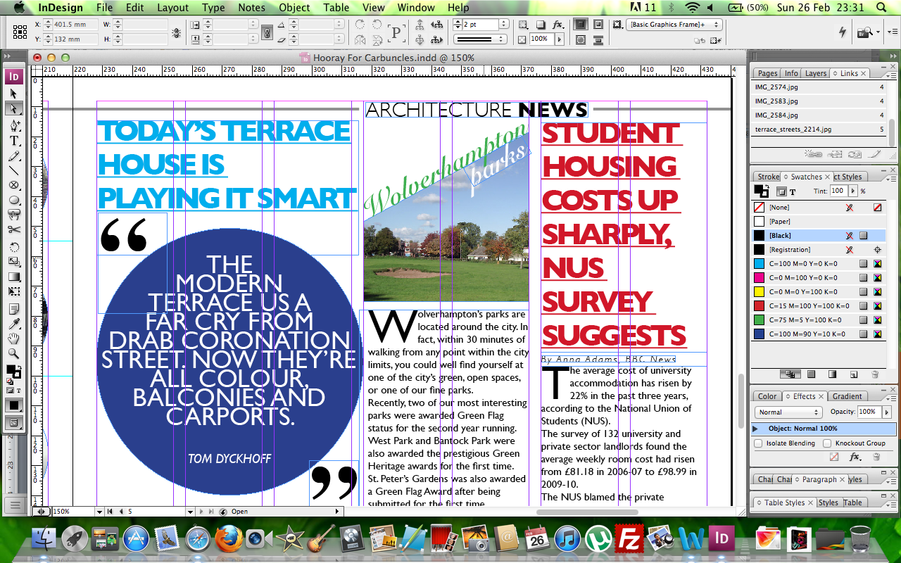 |
| Here is a close-up of the start of the 3 articles. The center column can be seen as a problem here. Also, whilst researching current magazines, I noticed how quotes were being designed. I used a similar approach, with this quote I experimented with kerning, leading and inner-character spacing. I did try to wrap this shape with the text in the centre article but just did not work. Also, the running head can be seen here too. |
 |
| This screen shot shows two more quotes from the final two articles. The first quote, I have manually condensed the font (vertically) and has been skewed. The second quote has been more vertically condensed and the inner-character spacing has been tightened. |
 |
| Text has been wrapped around the 3rd circle. |
 |
| Tom Dyckhoff's quote. |
 |
| Quotes of 2 news articles. |
 |
| Final DPS. |
they look good so far have u decided on a size for it yet?
ReplyDeleteYeah the page sizes are going to be 220mm x 315mm. Still playin about with the layout and typefaces
ReplyDelete